

A golf tournament poster is the first sale your event makes: if it doesn’t work on a phone screen, you lose entries before anyone gets to the rules. At Hola in Company we review dozens of pieces every season, and the same five mistakes come up again and again. None of them is a matter of taste. All five cost you players.
The good news is that none of these mistakes calls for an expensive redesign. They are adjustments to hierarchy, size and contrast that any club manager can request before sending the poster to print. We go through them one by one, with a specific fix for each, so your next piece works in your favour.
The five mistakes at a glance
This is the full sequence as we share it with club managers. Each card points out one mistake and explains why it costs you entries. If you recognise several of them on your latest poster, don’t worry: they are exactly the ones that are quickest to fix.
01 · All sponsors at the same size
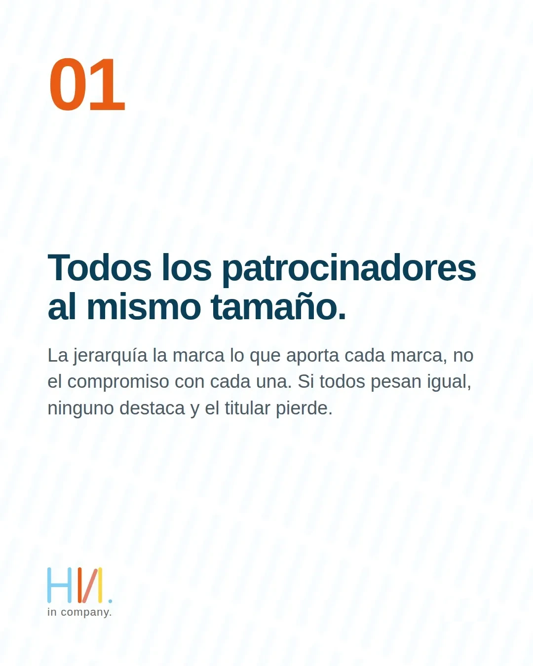
Giving every logo the same size looks fair, but it says the opposite of what you intend. Hierarchy isn’t about how committed each brand is; it reflects what each one contributes. If every sponsor carries the same weight, none of them stands out and the headline of your tournament poster loses impact.
The fix: define two or three sponsorship tiers and carry that hierarchy over to logo size. Title sponsor large and at the top; supporting partners grouped together at a smaller scale. Each brand sees its real tier reflected, and the layout gets room to breathe.
02 · The date in small type
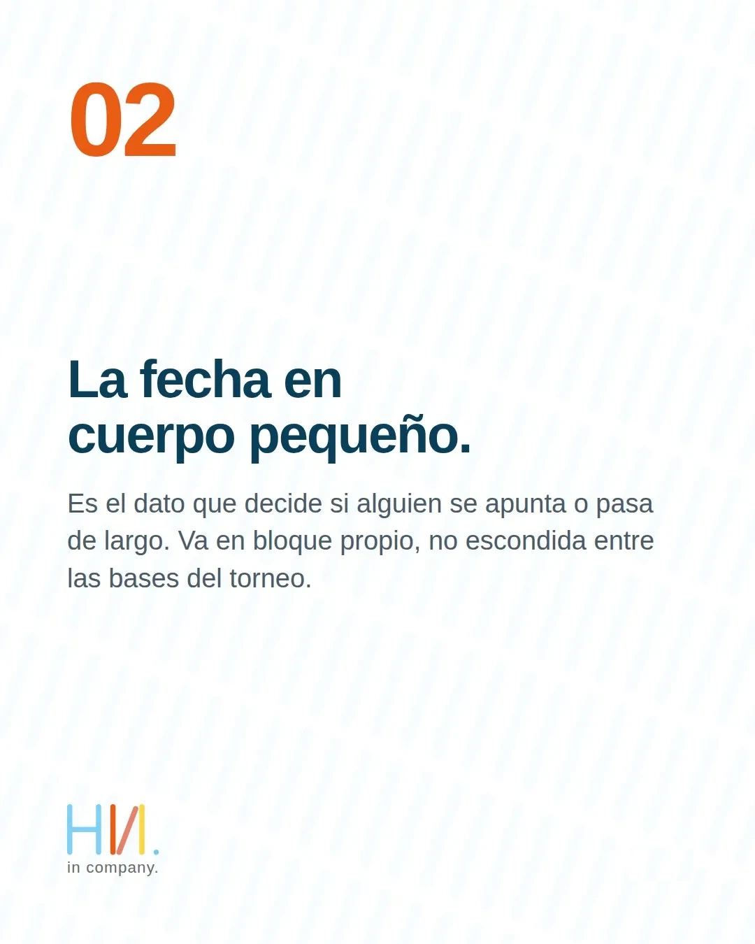
The date is the detail that decides whether someone signs up or scrolls past, and far too often it ends up buried among the rules. It belongs in its own block, in large type, not diluted in the footer. When the date competes with the regulations for the same space, the regulations win and the reader leaves.
The fix: treat the date as a second headline. Set aside a clean area for the day, the time and the course, with enough contrast to be read at a glance in an Instagram story.
03 · Text placed directly over the photo
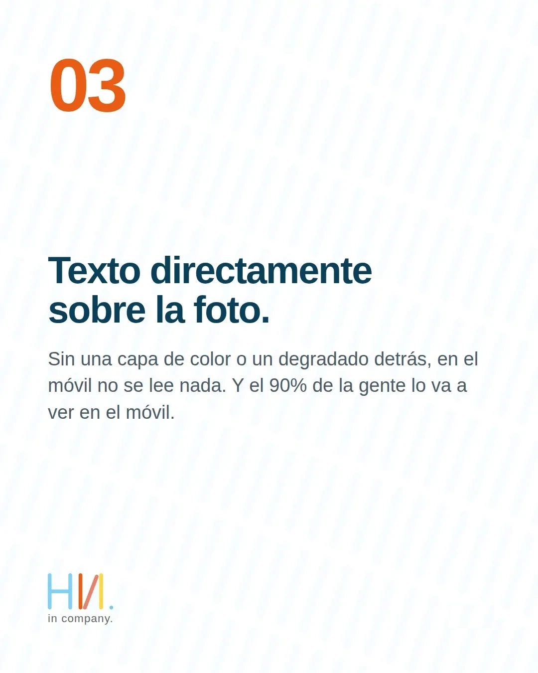
A striking course photo invites you to write over it, but without a colour layer or a gradient behind it, the text disappears on a phone. And most of your audience will see the tournament poster on their phone, not printed at A3 on the clubhouse noticeboard.
The fix: add a colour band, a gradient or a semi-transparent box beneath the text. It doesn’t hide the photo; it gives the message the contrast it needs to be read first time, in sunlight and on screen.
04 · Four typefaces in the same piece
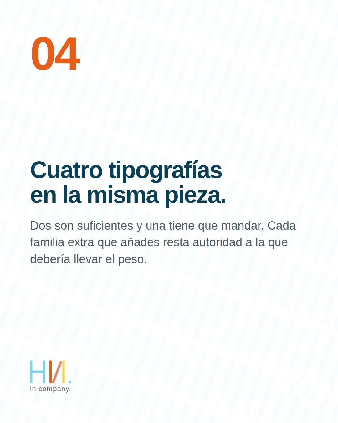
Mixing four type families on a single golf tournament poster undermines the one that should carry the weight. Two are enough: one for headlines and one for body text. Every extra family adds noise and makes the piece look improvised.
The fix: stick to two typefaces that contrast well with each other and build the whole hierarchy through size, weight and colour, not by adding fonts. A consistent identity on the tournament poster also strengthens the club’s image beyond it.
05 · No registration deadline

No deadline means no urgency, and without urgency people put it off. The registration deadline deserves as much space on the tournament poster as the playing date, because it’s the one that gets people to act today rather than tomorrow.
The fix: always include the registration deadline, clearly visible and with a clear way to sign up. If you can also add a cap on places, the urgency multiplies and entries come in earlier.
Before you send it to print: a quick checklist
Before giving your golf tournament poster its final sign-off, run through this checklist. If all five points are sorted, the piece is ready to sell:
- Sponsors are ordered by tier, not all at the same size.
- The playing date can be read at a glance on a phone.
- Text has enough contrast over any photo.
- There are only two typefaces in the whole piece.
- The registration deadline appears with a way to sign up.
Good design is only half the job: to fill the field, the tournament also has to be visible online. At Hola in Company we combine design with SEO and GEO positioning so your event shows up when players search for it. And if you want to follow how we approach golf marketing, you can find us on LinkedIn.
Send us your poster for a free review → Follow us on LinkedIn →
Frequently asked questions about golf tournament poster design
How many typefaces should a golf tournament poster have?
Two are enough: one for headlines and one for body text. Build the whole hierarchy by varying size, weight and colour, not by adding families. A piece with two well-chosen typefaces conveys more authority than one with four.
What information must a tournament poster include?
The playing date, the course, the format and, above all, the registration deadline with a clear way to sign up. The closing date is what creates urgency and brings entries forward.
Why doesn’t text placed directly over the photo work?
Because on a phone, where most posters are viewed, text without contrast disappears into the image. A colour band or a gradient beneath the text solves the problem without giving up the photo.
Can you review my poster before I print it?
Yes. If you’re organising a tournament this autumn, send us the poster by message before you print it and we’ll tell you what we would change, at no cost. It’s the quickest way to avoid the five mistakes that cost the most entries.