
Graphic design for sports clubs isn’t about making a piece look good. It’s about a player understanding in two seconds what’s at stake, when it happens and how to sign up. This summer we closed three very different projects (a tennis Open, a golf team tournament and the season launch of a terrace) and all three started from the same problem: a lot of information, one glance to get it across.
We’re showing them together because they explain what our graphic design for sports clubs involves better than any list of services could: three tones and three hierarchies, each solved differently.
In graphic design for sports clubs, information comes first
When a graphic design brief for a sports club lands on our desk, the first step isn’t opening the software. It’s sorting. Which piece of information decides (the date, the registration deadline), which supports it (categories, prizes, prices) and which just needs to be there without getting in the way (the phone number, the website, the club logo).
That hierarchy is what separates a poster that fills a tournament from one that gets looked at and forgotten. If you’ve already read our guide to the most common mistakes on a tournament poster, this is the other side of the coin: what we actually do once the brief is on the table.
Club La Barrosa tennis Open: one photo and one word
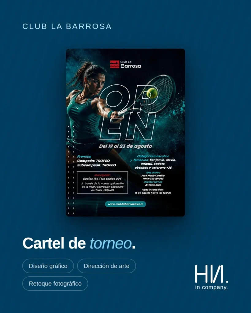
The brief was for a poster that could stand up against any professional tournament. We solved it with full-bleed action photography, saturated turquoise on black and the word OPEN in outline, running across the image without covering it. The player stays fully readable; so does the headline.
Below that comes the dense part, which is where graphic design for sports clubs is really tested: six categories (benjamín, alevín, infantil, cadete, senior and veterans 35+), men’s and women’s, prizes, referee, tournament director, prices for members and non-members, the Real Federación Española de Tenis app through which registration is handled, and the closing deadline. All of it laid out in two columns, so nobody has to hunt for their category.
The tournament dates, 19 to 23 August, sit right under the headline, and the registration deadline goes next to the price: those are the two details people check together. Pairing what gets read together is routine in graphic design for sports clubs.
VI Gran Copa Barceló: when the course is the argument
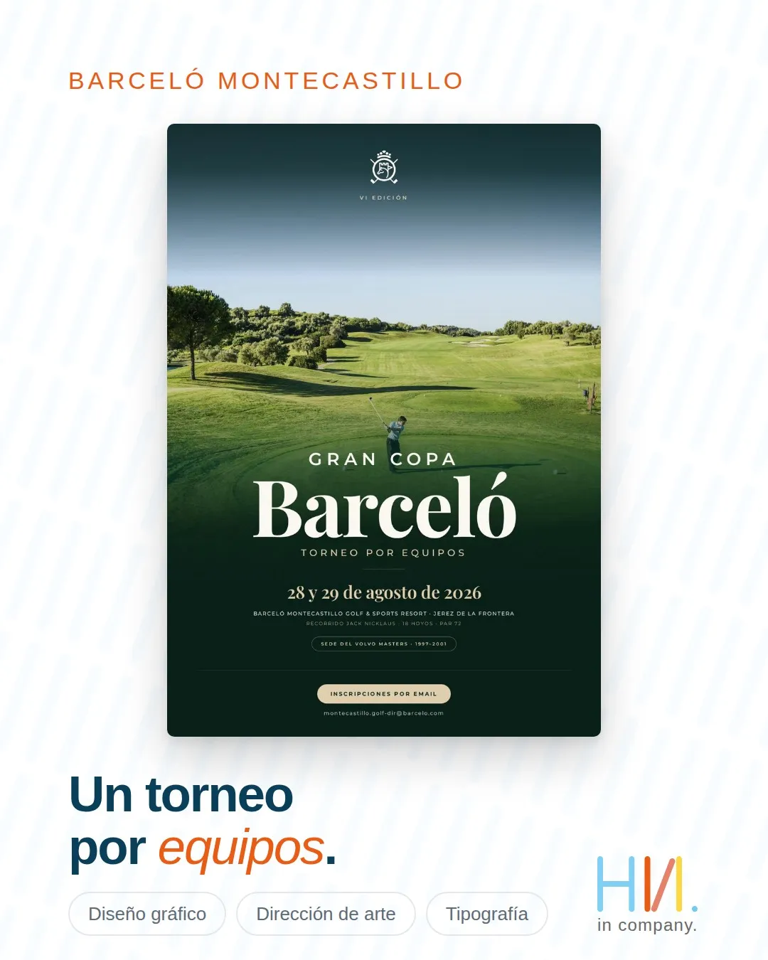
Here the starting point changes. Barceló Montecastillo has an 18-hole, par 72 Jack Nicklaus course in Jerez de la Frontera, and it hosted the Volvo Masters from 1997 to 2001. When the course is the argument, the course leads: full-bleed photography, a gradient into the corporate green and a serif with real character for the name. Everything else stays out of the way.
That Volvo Masters venue badge isn’t decoration. It’s the resort’s strongest credential, so it gets its own pill, separate from the rest, where it competes with nothing. Recognising which asset carries the most weight is a large part of the job in graphic design for sports clubs.
The rest is straightforward: a team tournament, 28 and 29 August 2026, and registration by email. Not one detail more.
Real Novo Sancti Petri terrace: readable in two seconds
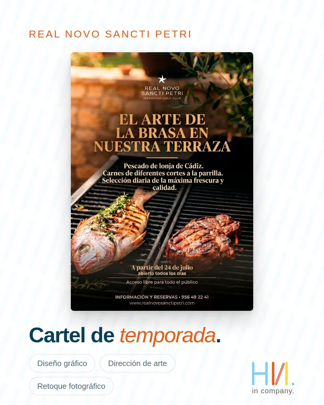
This isn’t a competition poster, which is exactly why we want to show it: graphic design for sports clubs also covers hospitality, services and everything a member checks without ever stepping onto the course.
The goal here was very specific: that a member would know within two seconds that the grill was open. Our own photography of the grill, a heavyweight typeface for the headline and the service details at the bottom, where they don’t get in the way. Fish from the Cádiz fish market, different cuts of meat and a daily selection; from 24 July, open every day and open to the general public.
We weren’t aiming for pretty. We wanted it understood at a glance on a phone, which is where almost everyone was going to see it.
What repeats across all three projects
Three pieces that look nothing alike and still share the same underlying decisions. We apply these four to every graphic design for sports clubs project:
- One big idea. One headline, one focal point. If there are two protagonists, there are none.
- The photo never competes with the text. It moves aside, it gets darkened, or the text wraps around it. Never just stacked on top.
- The closing detail is always visible. The registration deadline, the opening date. No urgency, no action.
- The club’s brand comes before ours. The poster belongs to the club, not the studio.
How we approach graphic design for sports clubs
Behind these pieces are three disciplines working together: graphic design, art direction and, depending on the case, photo retouching or typography work. On the tennis Open and the terrace, the image needed retouching; on the Gran Copa, the typography held the whole poster up.
We work with the club’s own material and its brand guidelines when they exist. When they don’t, we build them as we go, with criteria that can be repeated next season, because graphic design for sports clubs only pays off when piece number ten looks like piece number one.
And we don’t stop at golf: we work with golf, padel, tennis and swimming, and each sport has its own visual language. What works on a green doesn’t work on a court, so graphic design for sports clubs has to adapt to each discipline. The three posters in this post are real projects for Club La Barrosa, Barceló Montecastillo and Real Novo Sancti Petri. And there’s plenty more in our portfolio.
That’s the summary: less decoration, more decisions.
Tell us about your project →
See what else we do →
Frequently asked questions
How far in advance should we order a poster?
What sets the calendar isn’t the design, it’s the registration deadline: the piece has to be circulating well before that deadline closes.
Do you only work with golf clubs?
No. We do graphic design for golf, padel, tennis and swimming clubs, as well as for their food and beverage operations and services. The three examples in this article come from different contexts.
Do we need our own photo shoot?
It depends on the piece. For the Real Novo terrace we used our own photography because the product was the star. In other cases we work with the images the club already has and retouch them so they hold up in the format.
What do you need from the club to get started?
The final details of the event or service, the logo in good quality and the brand guidelines if there are any. That’s enough to start any graphic design for sports clubs project. If something is missing, we say so before we begin, not halfway through.
Can the same piece work for a printed poster and for social media?
Almost never as is. The format changes, and the hierarchy changes with it: what reads well on an A3 poster hanging in the clubhouse doesn’t read the same on a phone. The usual approach is to adapt the piece for each placement, not stretch it.